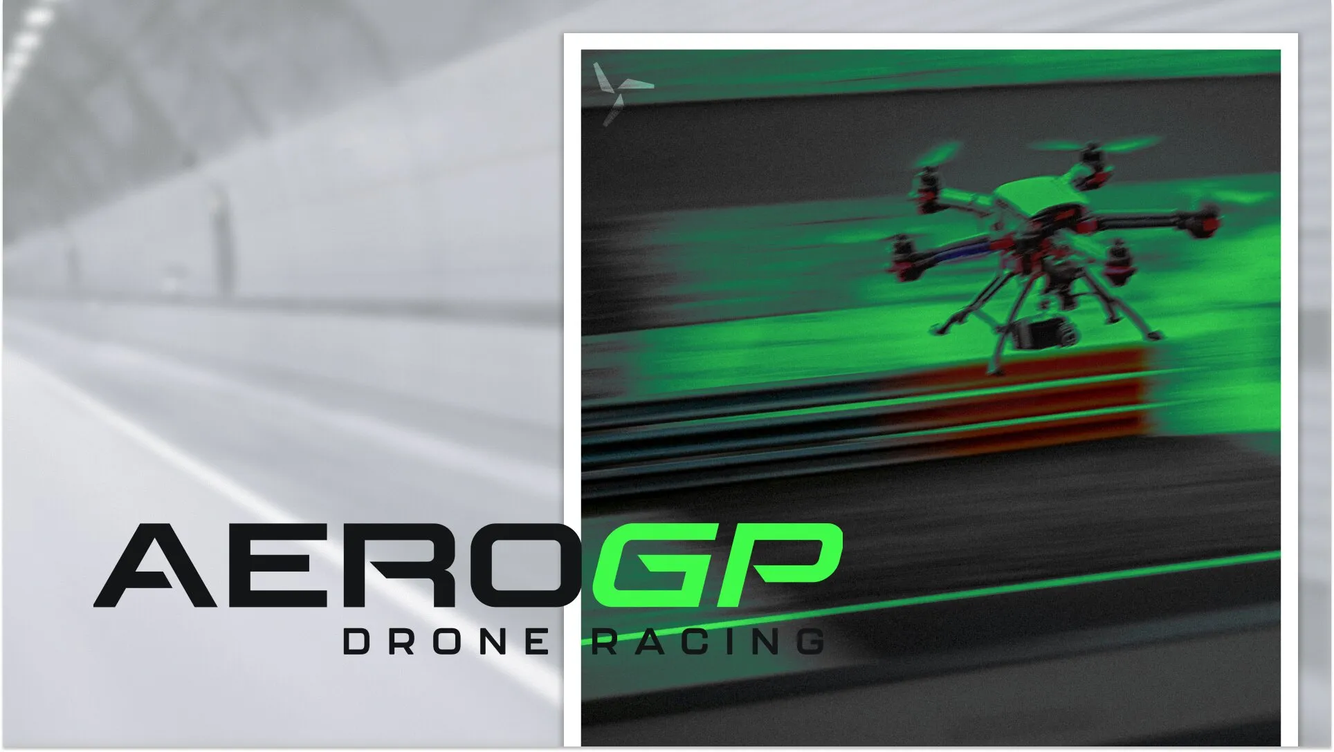
Defining the visual language of FPV racing: A modular (re)branding that translates the adrenaline of flight into a professional modern racing ecosystem.
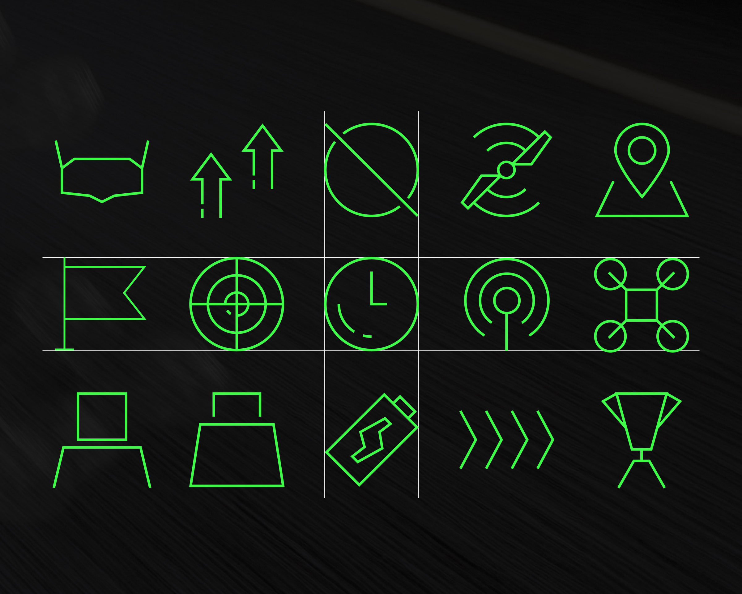
AeroGP is a comprehensive rebranding project for a global FPV (First Person View) drone racing league. The work transforms a fragmented, amateur-led sports niche into a professional, high-impact brand ecosystem. By combining modern typography, a high-contrast color palette, and a modular icon system, the identity captures the technical precision and raw speed of drone racing across digital platforms, physical applications and event environments.
The Challenge
The project originated from an analysis of the existing drone racing landscape, which was found to lack a unified, professional visual language. One objective was to replace a generic branding which the project is based on, with a name and identity that explicitly evokes flight, air, and the professional "Grand Prix" atmosphere. The design system needed to solve a dual requirement: extreme visibility for physical racing gates and merchandise, and technical clarity for digital interfaces.
The Process
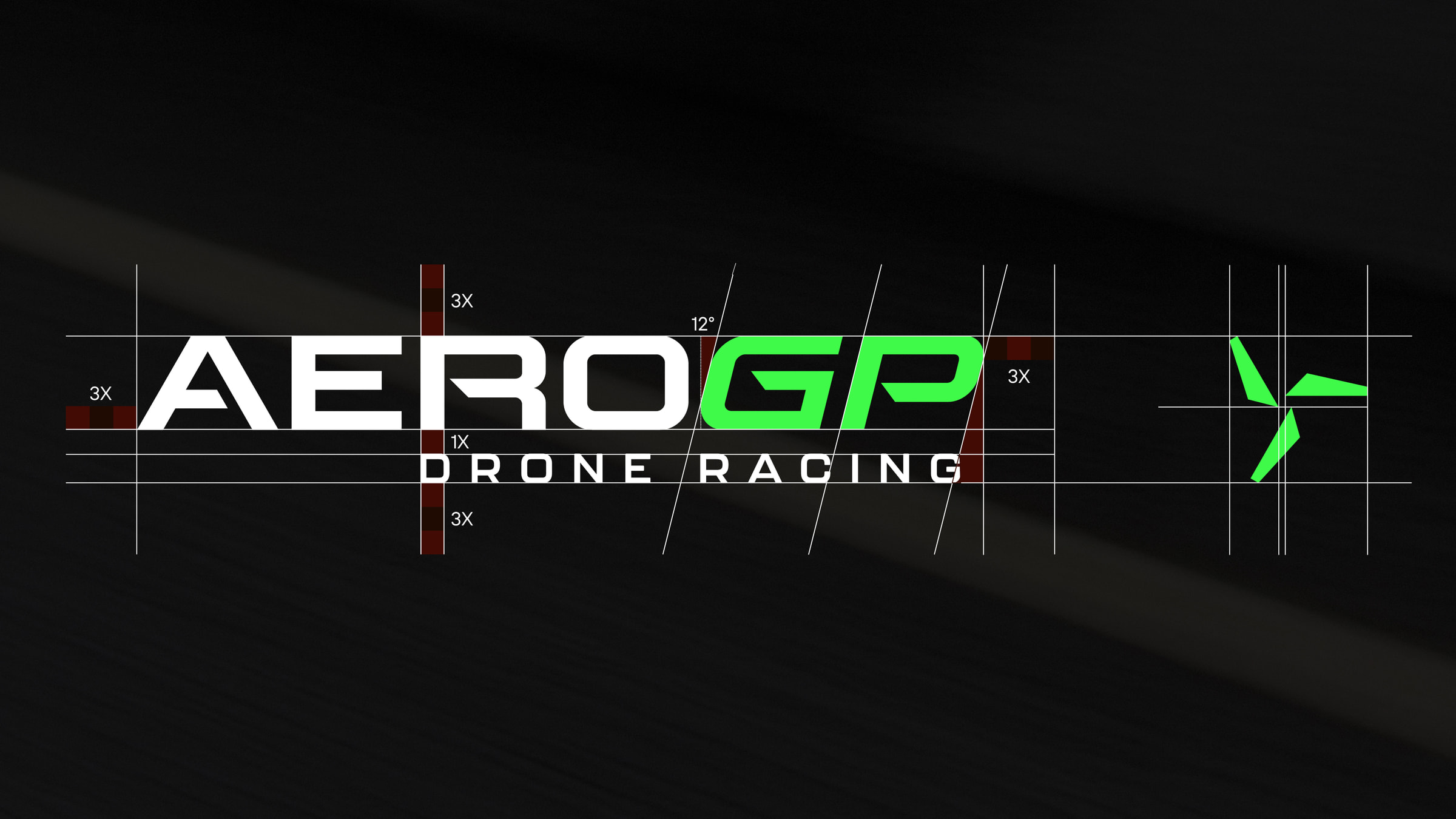
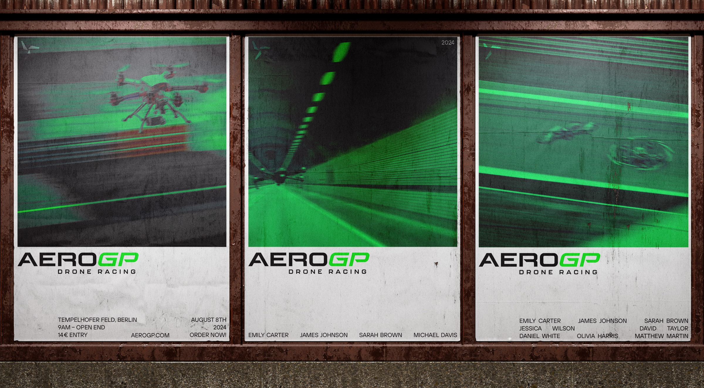
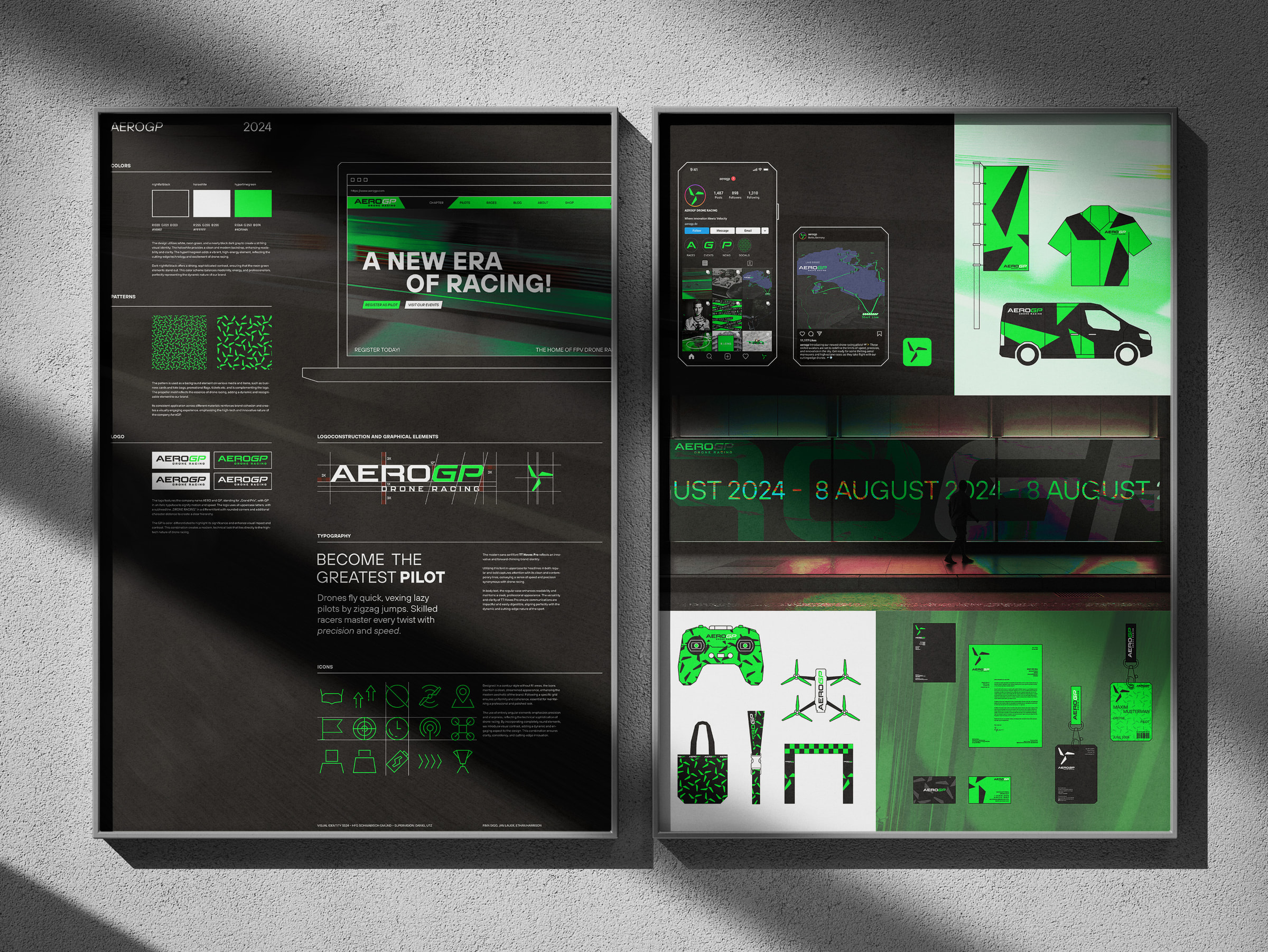
The Logo was designed as a purely typographic mark. It consists of the word AERO in a stable, upright form, contrasted by the italicized GP in the secondary accent color to signal movement and constant forward motion. A right-aligned subheadline completes the mark, providing a clear hierarchy for the brand name. Centered in the visual identity is the Propeller Icon, a modular element built from three sharp-edged rectangles. This icon serves as a versatile anchor for the design, appearing in various densities to create dynamic patterns for both print and digital applications.
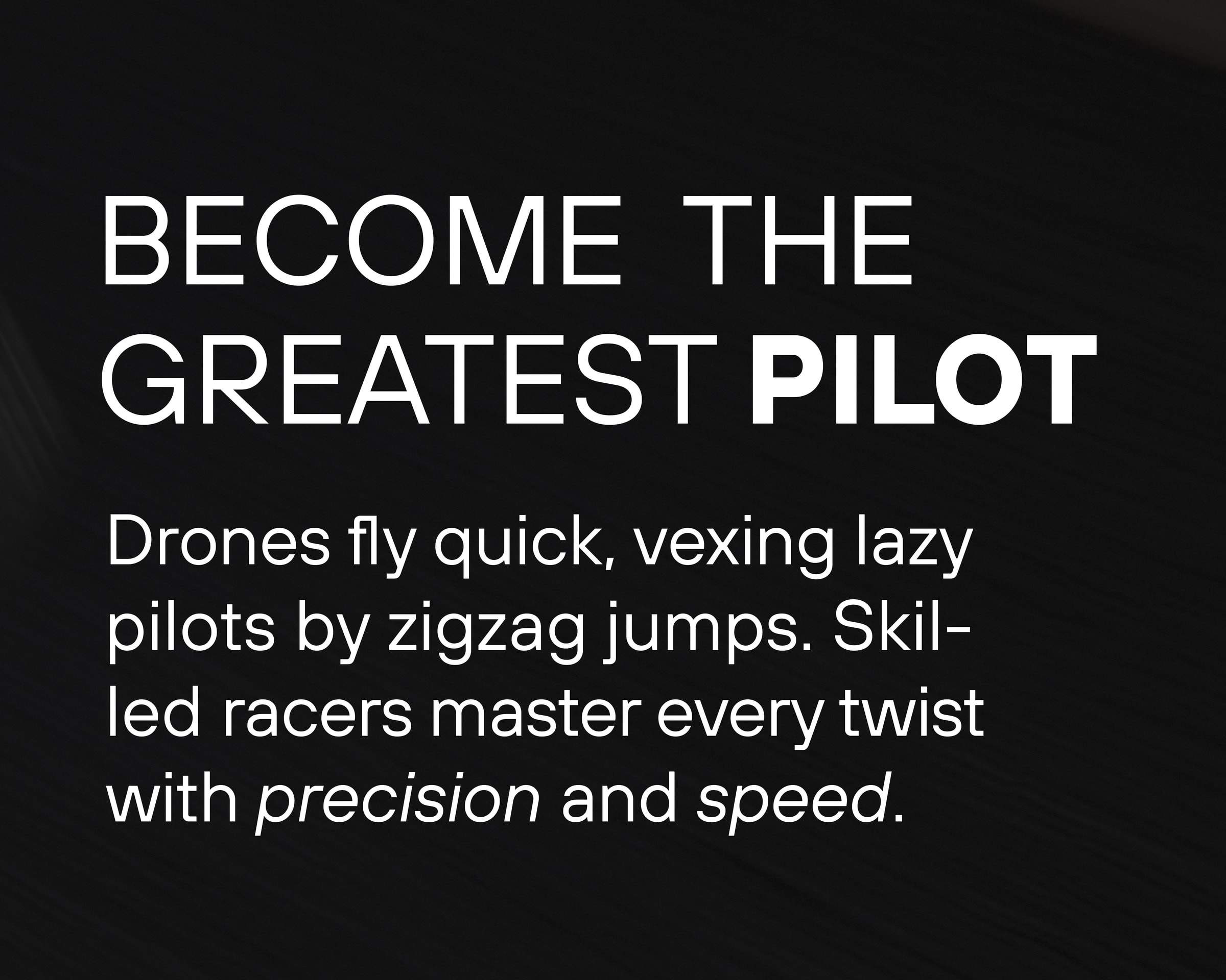
A modern and high contrast color scheme ensures clarity across all touchpoints. A modern Hyperlimegreen which was selected for its extreme visibility against Nightfallblack, maintaining brand presence under challenging lighting conditions. The geometric typeface TT Hoves Pro supports this aesthetic, with headlines set in all caps to reinforce the brand's authoritative tone.
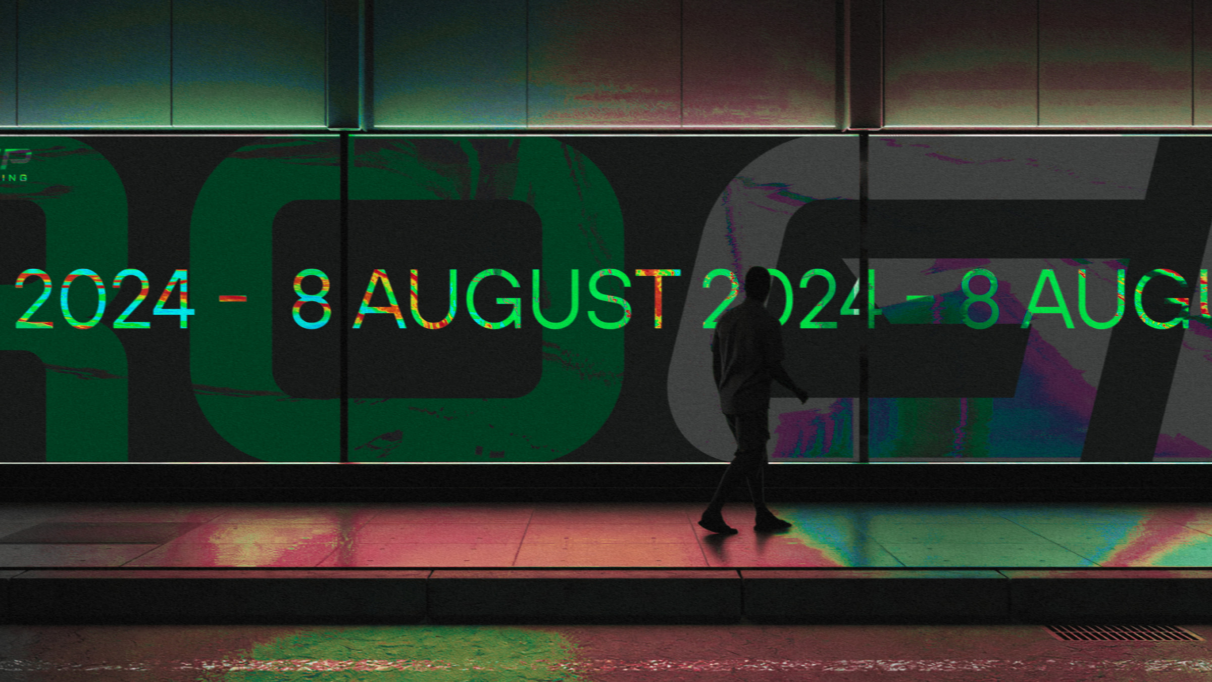
The resulting brand ecosystem ensures a seamless transition between the digital and physical elements. The Design Application extends across a wide range of touchpoints: from high-visibility racing gates and pilot equipment to merchandise like tote bags, lanyards, and drone controllers. Even event logistics are integrated, with the identity applied to transport vans and staff passes to create a professional racing environment.
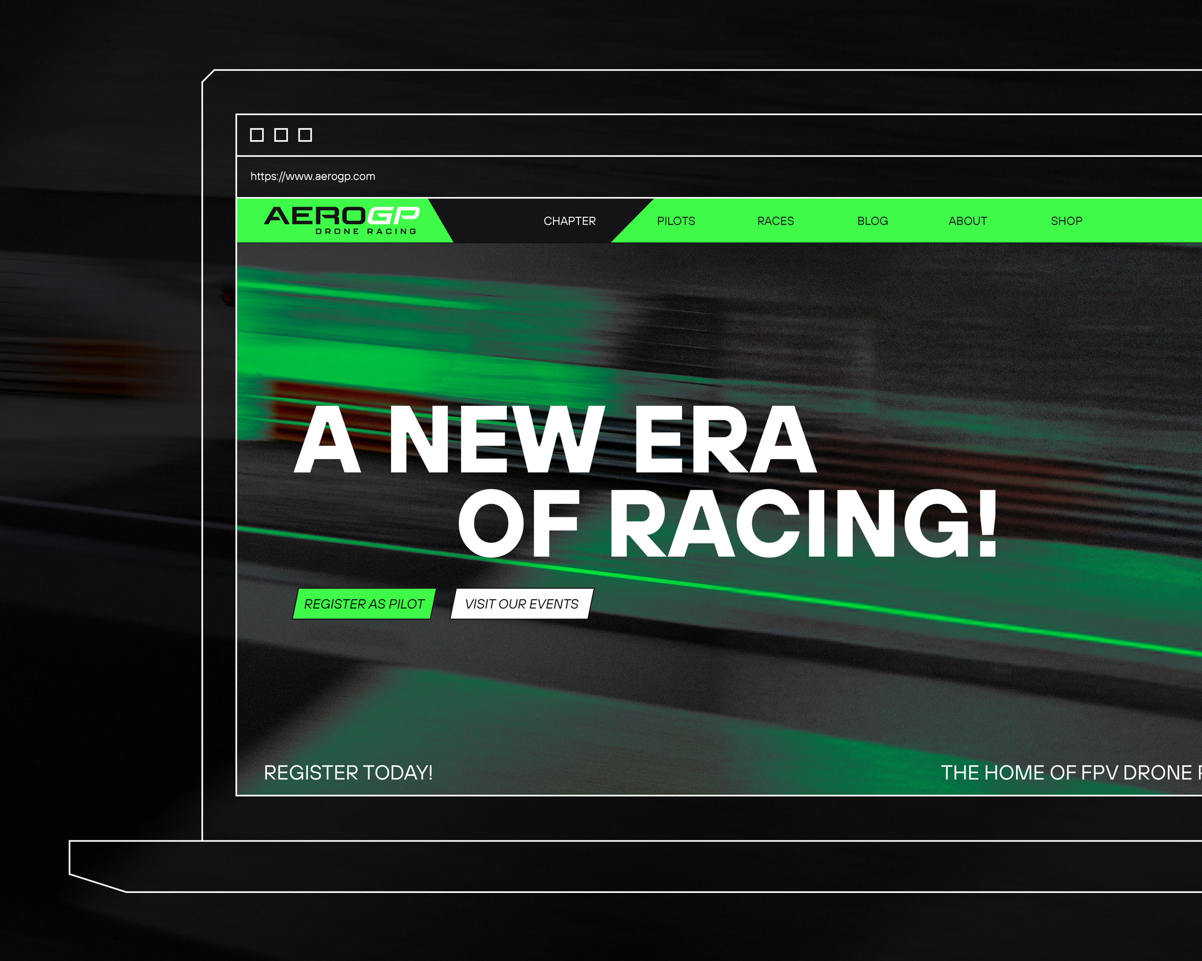
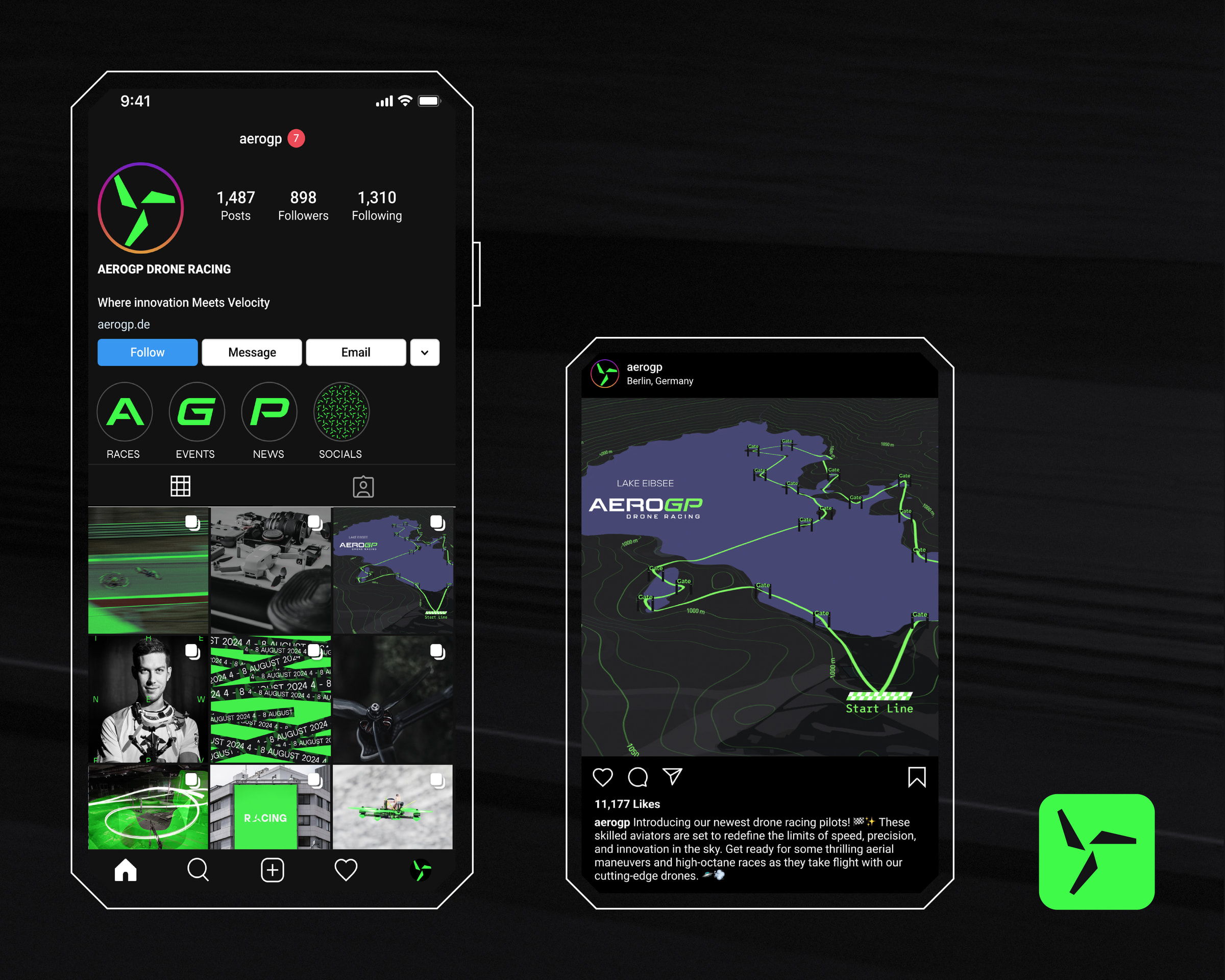
The brand's energy is further amplified through a promotional video. It utilizes desaturated, fast-cut footage combined with design mockups. This is complemented by a Logo Animation, where individual letterforms are built from basic geometric shapes in a staggered sequence, clearly defining the brand layers AERO and GP and Drone Racing.
More Projects